Display advertising is tricky business. It’s a challenge getting people to click your ads. And when you do get them to click it’s a challenge to get them to convert. By the time you’ve got the conversion thing figured out your previously effective banners may be losing their potency.
When you get it right though – It can mean huge profits.
Let’s take a look at the banner portion of that equation. We’re going to look at “good starts” and “bad starts.” We’re saying it’s a “start” because you’ll never be done designing banners. You’ll always be testing to improve CTR, improve conversions, etc. To think you’d ever create a set of banners and be done is foolhardy.
Now don’t get all worked up if you don’t agree with my opinion on some of these banners. It’s not an exact science and sometimes banners that you’d never think would work do well.
So with that said – let the show begin…
Good Starts
#1 Apple
http://www.moat.com/search/results?q=Apple
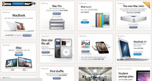
These ads have a super clean design (as does all of Apple’s products). This tech giant knows design better than most. Their banner ads are no exception. They’re easy on the eye and the call to action button pops right out.
#2 Liberty Investor
http://www.moat.com/search/results?r=1&q=Libertyinvestor.com
These are a bit ugly but I’ve seen banners like this work very well in the past. They’re simple, ugly, and have blue text that screams “hyper link.” People click blue text on the web. Even when it’s a banner.

#3 Drive Arcade
http://www.moat.com/search/results?r=1&q=Drive+Arcade
These are very interesting. You might look at these and say “wtf?”
But these banners are more clever than their simple design lets on. First of all they look like a video with that big play button (instantly going to increase clicks). Second of all the background clearly looks like a video game (speaking to a very specific demographic). The end result = most people that click this ad are expecting a video of a driving game.

Bad Starts
#1 Bleacher Report
http://www.moat.com/search/results?r=1&q=Bleacher+Report
Too Busy! The background images create a lot of visual noise taking away from the copy and the call to action.

#2 – T.M. Lewin
http://www.moat.com/search/results?r=1&q=T.m.+Lewin
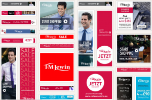
At what point does minimalist design become ineffective? Take a look at these banners. Some are better than others. The one that sticks out the most as a glaringly bad example is the red square that simply says T.M. Lewin and nothing else.
Either they’re vain enough to think that people just know their brand (I didn’t) OR they’re playing on the fact that you might not and are intrigued enough by the bold redness to click. Either way – it’s lame (in my humble opinion, of course).
#3 – PolygonHomes.com
http://www.moat.com/search/results?r=1&q=PolygonHomes.com
Holy Crap! What am I supposed to look at here? Nuff said.

#4 – Long Jewelers
http://www.moat.com/search/results?r=1&q=Long+Jewelers
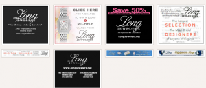
My biggest pet peeve is a lack of a call to action (and not responding to my emails – but that’s a different story).
That’s Internet marketing 101! No call to action and you get exactly what you’ve asked for. Nothing.
Beyond that I found the text very hard to read. If I feel like I have to “work” just to read your banner I’m going to skip right over it.



![[Swipe File] A Golf Niche Media Buyer golf media buyer](https://scoop.offervault.com/wp-content/uploads/2013/10/golf-media-buyer.jpg)

This information was as effective as a stout cup of coffee, it’ll wake you up. Great info. Thanks for the post, Dustin.
Jerry K.
Awesome analogy Jerry, thanks! My goal was to present brief useful insights into how I look at banner ad design.
While I agree that the TM Lewin Big Red Box is lacking for a technical reason, i.e., it isn’t obvious, at least to me, that it should be clicked on, accusing them of vanity may be vanity itself unless you live in Europe and have good knowledge of their brand presence. I don’t. And it could be that Europeans respond differently to that kind of link presentation. You didn’t mention either of these possibilities in your article so I must conclude you didn’t consider them for this rush to a simplistic presentation of a complex topic.
This observation is right on.