After a whirlwind of updates from Google there is a path as bloody and broken as far as the eye can see. That’s not journalistic embellishment. Site owner’s have lost entire income streams as Google continues their SERP “housekeeping.”
Where there is change there is opportunity, however.
One way you can change to capitalize on ranking opportunities is to increase your stick rates. Stick rate is that tiny but all-so-important web metric that measures how long someone stays on your page / site. The longer they stay the more Google believes your page is of value.
Recently I was doing some research on a trending niche and came across something you might find interesting.
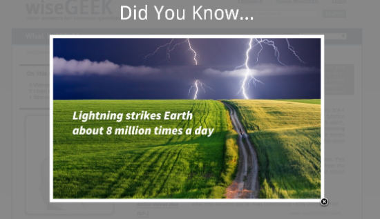
It’s an exit pop designed to catch your attention and keep you on the page. Even if it’s just for a few seconds longer. Here’s what it looks like:

On the site that image is actually part of a slide show. It moves pretty quickly too. You’ll see a new image with a new fact every few seconds. I was kind of shocked when I first saw it. It popped up as soon as the mouse hit the tab in my browser.
This thing literally stopped me in my tracks.
It only took a few seconds and slides to realize what was going on. It’s simplicity is brilliant and effective.
This was used on a general information site (http://www.wisegeek.com). But this could be used on ANY niche site. The slides could be weight loss facts or tips, dating tips, health facts, fantasy football stats, etc. This has infinite niche applications.
Run a test on your site. I bet it increases your stick rate. In turn – it may even help your rankings.


I have always liked the pop ups, if that’s possible, that show up when you are reaching for the close tab. Even to just go back and close that adds a few seconds to your time on the site, but to have something that people will actually be interested in is brilliant. Do you know what it is they are using to do that?
Sorry I don’t know exactly what software they are using to do that.