I love when I see a plan come together. Some of the best campaign building inspiration you could ever hope to have comes by surfing the web. That’s right, simply surfing the web and clicking on ads. When you do that beautiful campaigns literally jump out at you.
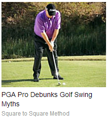
It was just the other day when I was doing exactly that. Surfing and clicking. I was in the midst of some mindless article skimming when all of a sudden a group of ads caught my eye. One ad in particular resonated with me. It looked like this
It’s not particularly eye catching. It’s only a little bit hyped up. It’s simple and to the point. You could say that it’s quite brief. The art of brevity is often overlooked in our world of affiliate marketing.
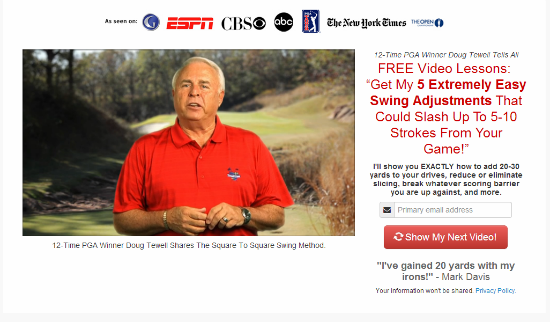
So like a naturally peaked browser – I clicked. The click brought me here.
Now this is a deceptively well thought out landing page. Right off the bat it hits you with the “credentials” images. ESPN hit my eye like a cup of cold water poured in my lap. The video began to play and seemed well scripted from a pre sell perspective (even though I paused it quickly cause I was in a quiet place). The red headline was what really connected with me however.
“Free Video Lessons”
Based on the quality of the optin video I’d be willing to be bet that these video lessons were high quality. That gave this optin bribe a high perceived value in my opinion. I was hooked and ready to sign up when one last little thing caught my attention. It was a spinning icon within the red button you press when opting in. Subtle and eye catching. Very nice.
After opting in I saw this:
It was a good looking and seemingly well written sales page. What I liked about the copy was that it didn’t just offer training on how to “increase my swing” or “stop slicing.” This copy offered me a way to do all of that in a “body friendly” way. That’s truly appealing to someone with chronic pain but still wants to play the game they love.
The offer was for video instructionals. You could buy a digital or physical version or both. They utilized a scarcity discount tactic to tweak conversions. Although I didn’t buy I’m willing to bet there was an upsell. This is most likely just the front end product. Whoever is running this campaign knows what they’re doing. It’s classic direct response and fun to see as a fan of the art.
But wait – there’s more!
This savvy marketer didn’t stop there. They’re doing some retargeting as well. A wise decision – retargeting has proven to drive highly qualified low cost traffic.
Here are their retargeting ads looked like
So there you go. A real world example of how savvy online marketers are putting together their sales funnels. What do you think of their funne? Let us know in the comments below.


Thanks for the great info,Dustin can you recommend any great easy squeeze page creators for mobile and desk top drag and drop simlpe.
Hmm.. that’s a great question. I’m not sure of any off the top of my head. I’ll research.