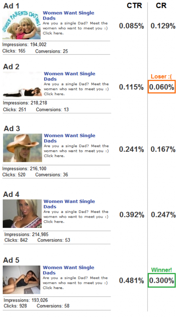
(On Facebook/PlentyOfFish Style Ads)
The following case study provided by AdChop.com analyzes the effect that images can have on an advertiser’s ROI.
These ads were part of a campaign that was run on PlentyOfFish.com to promote a dating website for single parents. PlentyOfFish offers many ad formats including the “Facebook” format that you see in this case study (110×80 image with a headline & body text).
These ads were targeted to US males age 30+ who had indicated on PlentyOfFish that they have children.
Note: The Conversion Rates (CR) below are “per 1,000 impressions” (not per click).
Analysis:
Since the text in each of these ads was identical, it was the image alone that determined the performance differences. The conversion rate of the top converting ad was exactly 5 times higher than that of the lowest converting ad, and the highest CTR was more than 5 times the lowest CTR.
Interestingly, the lowest CTR ad (Ad 1) was NOT the lowest converting ad per click. In fact, with 25 conversions from 165 clicks, it had by far the HIGHEST conversion rate per click.
Why did Ad 1 have the highest conversion rate per click? I presume that it’s because the higher CTR ads attracted many clickers who were simply hoping to see a larger version of the attractive woman in the thumbnail. Not only did Ad 1 not have the ” I MUST see a bigger image of that hot babe!” factor, the words “Single Parents Dating” in the image give a more accurate representation of the website they’ll be taken to. People aren’t being tricked into clicking on an ad that delivers something other than what they’re expecting.
I shouldn’t place too much emphasis on the conversion rate PER CLICK, however, because advertisers on PlentyOfFish pay a flat CPM rate rather than a flat CPC rate. The advertiser’s ROI is therefore determined by their conversion rate per 1,000 impressions (not per click)… which is why the conversion rate numbers above were calculated per 1,000 impressions.
Since images can play a major role in how an ad performs it’s worth split testing a lot of them, but it’s also important not to forget about the ad copy. In this campaign, the headline “Women Want Single Dads” was used because previous split tests had proved that it was far more effective than the more straightforward “Meet Single Moms”.


If this is my campaign I would have taken Ad1 to Facebook. It might get disapporved though because of the question and the smiley, but it’s worth trying.
Have you ever tried a CPS offer on POF? I would love to see a case study if possible.
Excellent info. Very interesting that different pictures could make such a dramatic result difference.
I would have to agree with the comment made by marketing online, If it were me I would choose to use Ad1. Its straight forward, and honest.
Just goes to show you. More creative advertising gets more creative results… and MORE results to boot. In a time where people are turned off on too much and intrusive banner advertising, truth and honesty, which is what most people want anyway, will almost always prove to be the clincher that draws more people into your offer. Just sayin’ ….
@ Jerry Lee: The site being promoted was SingleParentMeet.com. Yes the conversion was counted when users registered for a free membership.
Ad one is a very poor business choice. The purpose of an ad is to bring targeted people to view your offer. It has nothing to do with honesty. I do not mean to be dishonest, I mean that the ad should use any thing it can to attract the customer you want to see your offer. In the case of young males, their interest would be pulled by a picture of an attractive young woman. You can be honest on the landing page, your ad needs to pull you targeted customer out of the passing stream and get them to look at the offer.
It as no other function or purpose.
In the above case, suppose that these results are for 1 week and the offer pays $10.
Ad one will make you $250.00 a week or $13.000 a year.
Ad 5 would make you $580 a week or $30,160 a year.
Since the product is the same, Your sense of honesty cost you $17,000 a year.
If these results were per day, your sense honesty of would have cost you $124,000 in one year for no other purpose than to make you feel better.
Keep in mind that you have not done nothing here that is remotely dishonest. You have simply used a picture of what your target audience hopes to attain, instead of a less attractive image of what he might settle for.
Cool case study. Amateur images of curvy girls kill it on POF. You almost can’t do anything else.
The most professional looking photos clearly perform worse. The worst performer in the case study here is also too small to be shown on 110×80. Can’t really see her at all.
Justin at AdChop is really good at making short intriguing case studies on his site. Please also check out the case study we did for them: http://adchop.com/which-ad-for-women-seeking-rich-men-converted-best/
-Tom