Do your CTRs suck? Maybe you saw some success in the beginning of your campaign but you’re seeing continuous drops in CTR. Chances are your creatives are either really bad or your ads have become stale and it’s time to redesign.
To help you out we’re going to cover some basics that will apply to pretty much any type of banner ad creative. Obviously different strategies apply better to different traffic sources.
Tip #1 – Be Insane!
Take a look at this banner ad – it comes from a recent, highly effective campaign for www.forcefactor.com

Sick!
That banner is absolutely insane. Look at that guy. Who could possibly avoid looking at that mutant? Love it or hate it, it got your attention.
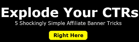
Tip 2 – Less is More
A common tip amongst marketers, it’s true. It applies to good landing pages, to good link building, to good web design, and it applies to effective banner ads. You can see it in the Force Factor ad above too – super simple – Headline, Copy, Call to Action.
DO THIS (Simple)

NOT THIS (Cluttered, Complicated, Confusing)

Tip 3 – High Contrast Colors
Make your ads pop by using high contrast colors. Like the AXA Equitable ads above, or even the Force Factor ad – the colors contrast well. Red agains a stark white background or Flesh tone agains an all black background. Contrast for clicks!
Example – (These banners are scaled down to fit this blog post and you could read them 5 feet from your screen – that’s contrast)

Tip 4 – Bold Button Call To Action
You can see it in effect in the AXA banners above. You can do this with any contrasting color combination. It makes your buttons (call to action) stand out driving the click. When someone see’s a big button they want to push it! My adhd buds know what I’m talking about.
Like This:

Tip 5 – Blue Underlined Link Call To Action
Just like when people see buttons, when they see blue links they click! Don’t get me wrong you still need to connect with the visitor through your ad. The point is that a blue link call to action is still effective (even though it’s not really a text link, it’s a graphic that looks like there is a text link in it)

By the way, www.moat.com is absolutely fantastic for doing banner ad research. It’s free and super powerful. That’s where all of these examples came from.
Any of you banner ad experts out there have any tips you want to share? I’d love to hear them in the comments below.


Hey Dustin,
As designers, a lot of times we think that the flashiest designs are best. When in fact, it is just the opposite, as you said. Simple, simple, simple is the way to go.
Great post! Thanks for sharing
Ian from IM Graphic Designs
Appreciate the examples and simplistic approach. Quite helpful.
WOW, new tips and really love your marketing policy through banner ads and affiliation all around. Keep sharing your future tips, eagerly waiting for your next update.