Oh the relentless pursuit of conversion optimization. It never ends! And why would it when you can make more money from the same amount of traffic through testing?
Testing is the keyword in that thought. Let’s take a look at a few tips to help you increase your conversions. Maybe they’re basic… maybe they’re not. Either way they’re fundamental and they’ll improve your ROI.
Tip #1 – Split Test Test The Ad (And no, I’m not wasting your time with this tip)
I didn’t want to exclude anyone here. This obviously applies to text ads and banner ads of any kind. Here are some concepts to test:
Outrageous – Make that headline beg to be paid attention to. Make that banner ad absolutely impossible to ignore. You can refer to the post I did about banner ads for visual examples of this.
Demographic Specific – Know your demographics and create copy that speaks directly to them. Polarize your message. Make your ad as niche/demographic specific as you can stand. Check out this banner ad I saw recently.
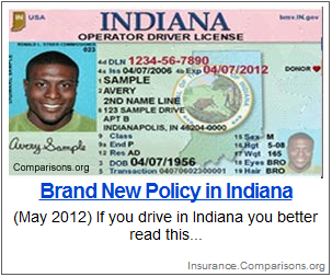
I live in Indiana, granted I’m not black, but the idea is still there. This advertiser knows how to connect with the people they want. This was a straight up static banner image. That means they’re showing banner ads on a state specific basis (at minimum). Pretty smart. What do you think? Do they have 50 different banners targeting 50 different states? I’m thinking they do.
Appeal to the “Anti-Scam” Mentality – You know the types. Those folks that are absolutely POSITIVE this Internet thing is just some high tech hijinks in disguise. They’re NEVER going to be taken advantage of! Speak to them. They’ll reward you for being honest with them.
- “Get This Report Before They Steal Your Money”
- “STOP, Read This Before You Get Scammed”
- “XYZ Is A Scam? Click Here To Get The Truth”
Obviously some of this may or may not make it on Google/Facebook. But there are definitely traffic sources out there where it will work just fine.
Tip #2 Rotate Landing Page Variations
This is a big one. If you did nothing else you could at least collect good data on what landing page style will convert best for your offer.
The “Acai” Blog Style – I only refer to it like that because a few years ago Acai promoters made a fortune off of this style of lander. It can be applied to almost any offer though. Unless of course you’re doing something very corporate in nature – but who the hell is doing that anyway?
Here’s basically what I’m talking about
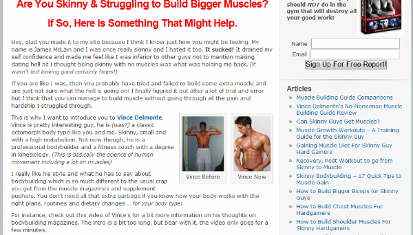
http://www.skinnytomuscle.net/
Check out the comments. That’s the real strength of these in my opinion. Social proof – BAM!
Comparison Table Style – Ahhh, an oldy but a goody. Simple concept here folks – build a landing page that consists of a table comparing the top 5 – 10 products in your niche (with star ratings)
Here’s what I mean
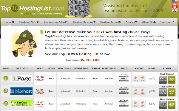
http://www.top10hostinglist.com/
Squeeze Page Style – The classic, the original high converting landing page. If you don’t know what a squeeze page is by now – I feel sorry for you… But because I’m a compassionate soul here’s an example
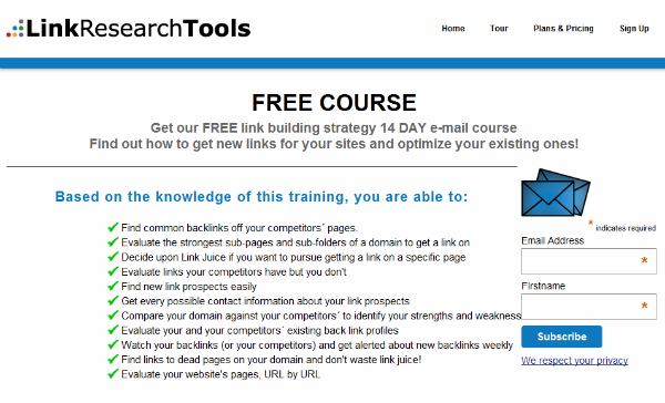
Sorry – no link for this one. I found it on Facebook though. It’ll show up for you too depending on your interests. It’s very IM specific.
This is a fairly vanilla squeeze. They’ve got navigation links at the top there. It’s not ideal because it gives your visitors options for leaving the page. But hey… I don’t judge.
So there it is. 2 ways to increase conversions. Do you have any specific testing elements you’d like to share? We’d love to hear them in the comments below.


Great post Dustin, stuff like this keeps me from being complacent!
Thanks
A reminder to 2 basic things that get lost & forgotten when we’re overloaded with new techniques that rarely works.
Thanks!