When was the last time you’ve used SEMRush.com? I’ll tell you what – they’ve stepped up their game recently. They’ve launched their new system design. I spent a little time with it and wanted to share what I found with you.
What I love
#1 Dashboard Overview Analytics
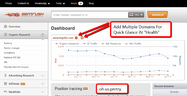
This was a really nice touch for busy site owners. When you plug your domain into the dashboard overview section you’ll see some interesting stats at a glance. You’ll see stats like:
- # of organic keywords ranking
- search engine traffic levels
- # of ads keywords
- ads traffic levels
Pretty good stuff for “at a glance” convenience. On top of that you can add multiple domains (Tabs allow for 4 comfortably).
#2 Amount of Data Available
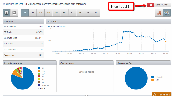
When you type in a domain name into the search bar you’ll get data on several key categories. They are:
- Organic Research
- Advertising Research
- Adsense
- Backlinks
- Keyword Research
#3 Google Based Data
This one is clutch. I don’t know about you but for me, finding good quality GOOGLE keyword data is getting harder and harder. I know there are those that say it doesn’t matter as much anymore. But to me, it’s still the major player in town and that makes a difference.
#4 PDF Exports
Great for client work, if you do that kind of thing. (also – look how damn beautiful that screen is)
#5 Data From Multiple Countries
Whenever I do trainings this question inevitably comes up.
“How do I get search data for insert country here”
Well now my answer is a lot easier. SEMRush. You can get search and advertising data from several countries. They are:
- US
- UK
- CA
- RU
- DE
- FR
- ES
- IT
- BR
- AU
Those are definitely the most popular countries I get questions about. So bam. There ya go.
#6 Backlink Tool (Beta)
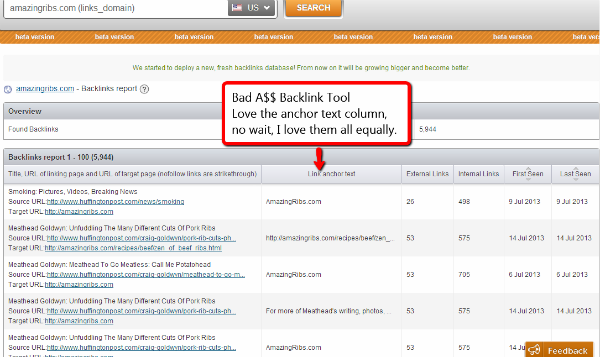
Although their new backlink tool is in beta, it’s clearly going to be a powerhouse. Just check it out in the screenshot below.
What I Didn’t Love (AKA Nit Pick)
Honestly this was a tough section to come up with. I’m kind of in love with SEMRush all over again. They’ve obviously spent a lot of time building this thing. And trust me, I speak from experience, developing intuitive useful apps is no small feat. So with kid gloves I’ll jump into the one nit pick I have so far.
#1 Navigation Confusion
At first it was tough for me to find the link back to the dashboard overview. I kept clicking “overview” and it didn’t bring me to the page I wanted. (The link to the dashboard is hiding in the upper right hand corner under your username in a drop down menu FYI)
Honestly… I tried to come up with something else for this section. I really did. I’m not taking the lazy man’s way out. It’s just that at this time – I have no other nit picks.
Is that to say the tool is nearly perfect?
Nah…
The more you use a tool the more you get a feel for it’s short comings. It’s just the name of the software developement game. Nothing is perfect. It can always be improved. But for now – I’m a happy camper.
I totally recommend you check this tool out if you’re at all interested in:
- Competitor intelligence
- Keyword research
- Tracking site analytics
- SEO
- PPC
- Media Buying
- Adsense
- International SEM data
Here’s a link to SEMRush.com


Agreed. Never stopped using it, as it’s always been good for keyword research, stealing competitor keywords, and finding competitors you weren’t even aware of. But they’ve been adding lots of new features recently. I also liked the fact that you can check which keywords you are in the top 200 for, gives you a good idea of how achievable some of those terms may be to rank for…