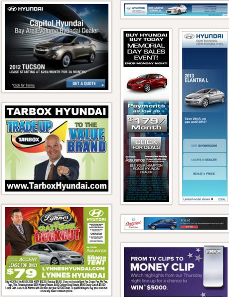
A few weeks ago we discussed affiliate banner ad design tips. There were several great examples of what makes a good banner ad in that post.
Today, let’s take a look at a few more banners. You’ve got to see a lot of images to get a feeling for graphic design. It’s just how it goes. The more you see the more sophisticated your pallet becomes.
Being able to see the difference between a good banner and a bad banner will help you in the long run. Let’s have a little session of Do This, Not That. You’ll see what I mean very quickly.
High Contrast Banners
Do This
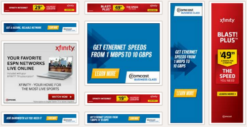
http://www.moat.com/search/results?q=comcast
Not That
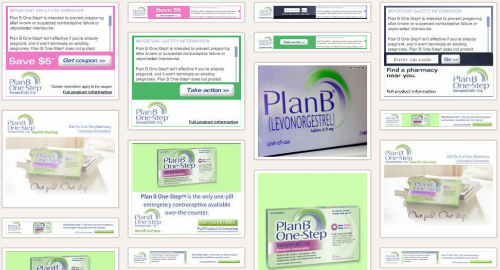
http://www.moat.com/search/results?q=plan+b+one-step
Call To Action Buttons
Do This

http://www.moat.com/search/results?q=pinnacle+gold+group
Not That
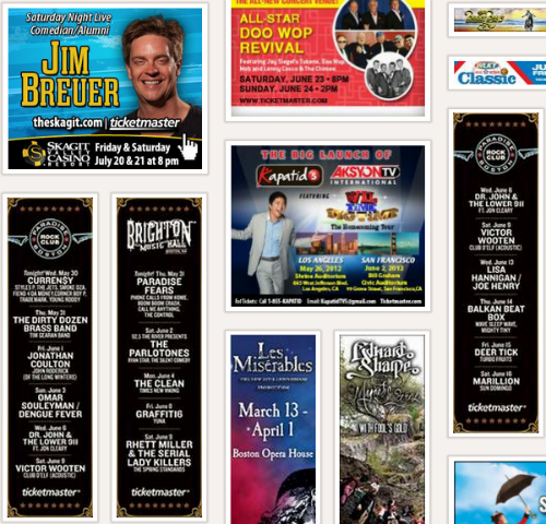
http://www.moat.com/search/results?q=ticketmaster
Less Is More Design
Do This
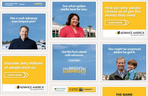
http://www.moat.com/search/results?q=advance+america
Not That
