We love display traffic around here. You can use it to get avalanches of targeted traffic. And best of all it’s scalable. There’s almost always more traffic than you could ever buy.
But there’s a problem with display. You have to actually make banner ads. Or at the very least outsource it. Either way you’re going to have to have a clue on what the banner should look like. And what’s worse is that you’ll be split testing many variations.
If you don’t know where to start you’re dead in the water. Here are some examples of good and bad banner designs.
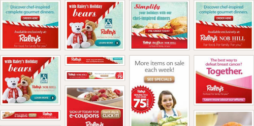
High Contrast
These are GREAT starts
The contrast in these banners really lead the eye to the button. While I don’t love the copy the color combos are well done.
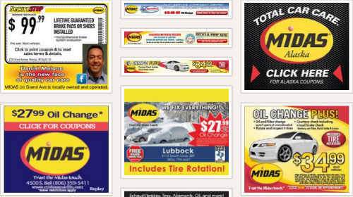
These are BAD starts
The Midas banners are not that bad. It’s the cheesy coupon / used car sales looking banners that really stink it up.
Call To Action Buttons
These are GREAT starts
You can clearly see where the button is on these banners. Simple, clean, good contrast, and very easy to see buttons.

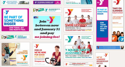
These are BAD starts
The word “join” is being used as the call to action in several of these banners. There’s nothing clear about the fact that they want you to click the banner though.
Less Is More Design
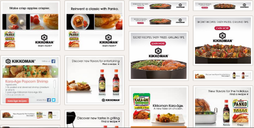
These are GREAT starts
I was kind of surprised that I liked these so much. Who woulda thunk that a soy sauce company would have great banners? Very uncluttered designs are easy on the eyes. Sometimes they can become invisible but this company uses nice contrast and images to keep them attractive enough to grab attention.
These are BAD starts
Hopefully it’s obvious to you why these banners suck. But you never know… they might be killin’ it. You’ll just have to test to find out for sure 😉
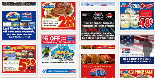
All banner research done via http://www.moat.com
We’ve talked about banner design a lot here at Scoop. Here are a few of our banner design posts to get your creative juices flowing.
Affiliate Banner Ad Design Tips


