let’s face it, landing pages are nearly essential in affiliate marketing. Almost all of the top level affiliates use landing pages in one way or another. If you aren’t using them it may be that one missing piece of the puzzle for you.
While no one will be able to tell you they have the best landing page format ever created, there are design traits that make some better than others. For example it’s long been known that the headline is an absolute essential aspect of a great lander. Could you imagine a landing page without a headline? It’d be awful.
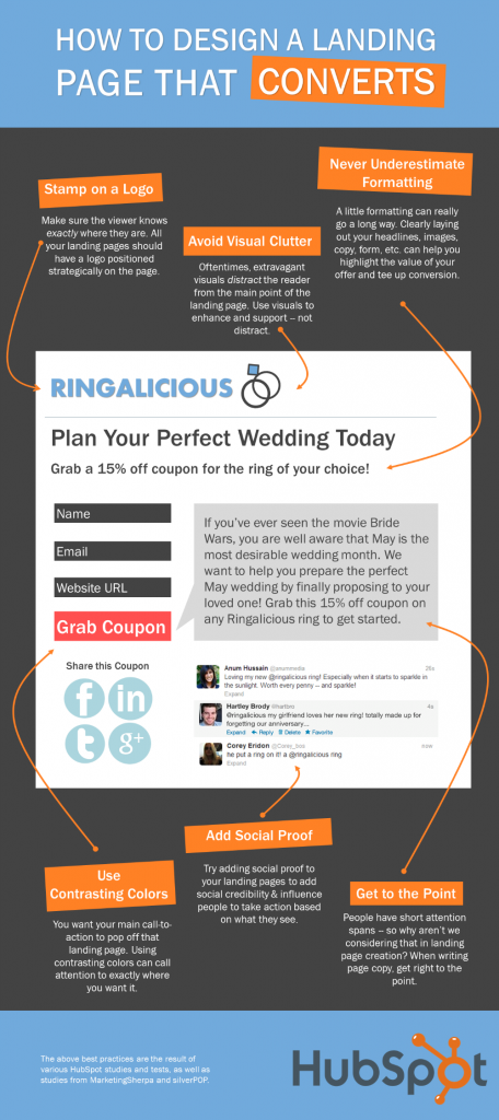
So today we wanted to share with you an infographic that covers 7 (nearly) fundamental aspects to a high converting landing page. Swipe these design tips at will! You’ll most likely find your next set of landers convert better because you did.
This handy infographic is brought to you by Hubspot’s article called 7 Key Design Tips For High-Converting Landing Pages


I like the idea of the social proof element. How do you propose it should be added: as a screenshot or “real” commenting feature. The latter can be negative though…