As affiliates we use them everyday. A call to action is tells our visitors exactly what we want them to do. It drives them. It funnels them. It get’s them to virtually raise their hand and say “Yes, I’m the one you want.”
It’s all about action.
A call to action has so much power it can literally…
- buys an item
- adds people to your email list
- opens an email
- opens a sales page
- brings new people to your web page
- adds product to a shopping cart
- adds upsell items to a shopping cart
- shares your content
- makes your content go viral
- PUTS MONEY IN YOUR BANK ACCOUNT
and probably a million more things.
In case you didn’t notice. A call to action is pretty damn important. So wouldn’t it be equally as important to learn ways to make them perform better?
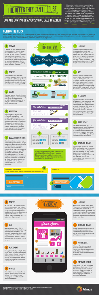
Below is an infographic that will do just that. While this particular graphic was originally designed for “email” CTA’s the simple fact is that these tips will work nearly anywhere else. What is graphically designed email but a type of landing page anyway?
This is a big one so you’ll need to click the image to see it in all of it’s large glory.
Big thanks goes out to Litmus.com for creating this awesome infographic
Which is your favorite tip? Let us know in the comments below


Wow! Very impressed with the infographic of CTA placement. Conversions are sure to come with these excellent CTA rules for emails. Thanks for great teachings.