I’m positive you have heard the following before, if not a gazillion times:
Optimize your landing pages.
Write killer headlines.
Test everything.
Even though these mantras have been shoved down every internet marketers throat from Florida to Tim-Buk-Too, I’d wager to say that the majority of those reading this very post haven’t a clue where to even begin with item one.
Chances are that is there an under-optimized page on your site, it’s your landing page.
Why is that?
The landing page is your first impression as well as the first opportunity to convert the coveted visitor into either a lead or customer.
Let’s face it, this isn’t the first article you or anyone else might have read on the art of Landing Page Optimization. In fact, when you query “Landing Page Optimization” in Google search you will be faced with over a million results. A million. I’d say that qualifies for an overload of information right at your fingertips.
This article is being crafted in a way that might help you to sort through all the B.S. and get right down to the nitty gritty of optimizing your landing page.
Start at the beginning
Why have a landing page? Good Great question.
In marketing terms, a landing page is a distinct page on your website that’s built for one single conversion objective. A landing page should be designed, written and developed with one business goal in mind.
Therefore, a blog article or post is NOT a landing page. It is meant to be a standalone page with a single purpose. This purpose might be to collect data from the visitor for the purpose of generating a lead, either for yourself or as an affiliate, direct sales or to build a relationship with the visitor.
Bits and Pieces
If you look at a handful of landing pages side by side, you will probably be able to easily pick out the key elements that they each have in common with the other. These elements are critical to successful communication with the visitor.
Using KISSMetrics “Blueprint for a perfectly testable landing page,” as a starting off point for constructing your own highly optimized landing page.
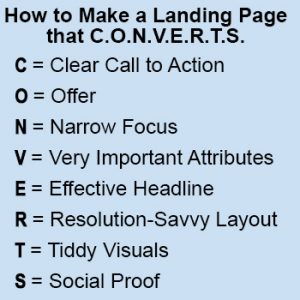
In addition to the above mnemonic, your landing page should also include:
- Killer headline – Like the almost extinct newspaper, the goal of a headline is to get the visitor on to the next line, then the next, and so on. A great headline is like a fishing lure that is meant to grab the reader’s attention. Using Upworthy.com as go-to source for learning the important task of crafting a killer headline. In their slide deck The Sweet Science Of Virality, they stress the importance of the headline over and over. For each post, Upworthy crafts a minimum of 25 different headlines. They then pick two and run a simple A/B split test.
- Hero Image – Primary image or creative. It should work hand in hand with the headline to grab the reader’s attention and reinforce your proposition.
- Proof points – Benefits (copy) that reiterates the promise you are making with your headline.
- CTA (Call To Action) – Depending on the type of landing page you are creating this will either be a form button, a simple download button, or both. All three should be clear and concise.
Extras (valuable items that aren’t necessarily mandatory for a healthy optimized landing page):
- Social proof – Testimonials or other elements that validate your brand
- Endorsements – Such as featured articles or prominent clients.
Nitty Gritty
You had to know there was more. With over a million results in search for this subject alone, there had to be more.
One of my good friends, who just happens to be a landing page expert, asked me to throw together a simple graphic for his Facebook page. The subject of said graphic: 10 Landing Page Commandments.
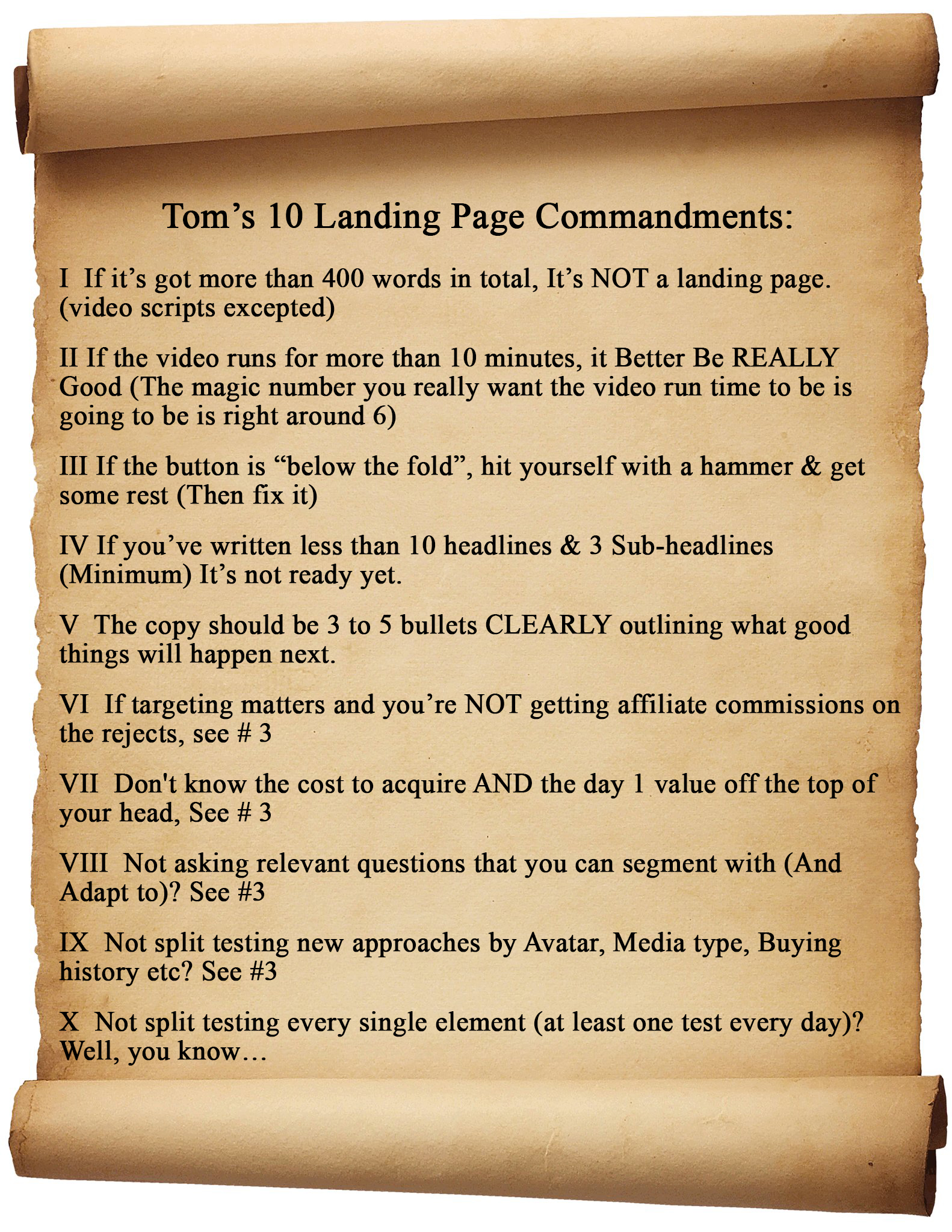
He basically lined out a simple blueprint of sorts to get you to the head of the line when it comes to optimizing your landing pages.
- Keep it short, under 400 words or less (this doesn’t include your video script if using one)
- Videos should be right around 6 minutes or less – people are busy
- CTA should be above the “fold” – the portions of a webpage that are visible without further scrolling or clicking.
- Headlines aplenty. Craft no less than 10 headlines and 3 sub-heads for each landing page.
- Copy should have 3-5 bullets outlining the positives of your brand.
- Set up affiliate commissions on all your rejects.
- Know your numbers – cost to acquire is something you should know at any moment’s notice.
- Ask the relevant questions to get you further down the line.
- Split test new approaches.
- Split test EVERYTHING.
Bottom line
There are certainly a lot of rules or tips out there for you to follow when creating a landing page, however if you follow the basics alone you will be well ahead of the game in the long run.
- Hook of a Headline
- Simple clear concise copy – keep it short
- Hero image
- Proof points to back up your claim
- Clear CTA (above the “fold”)
How are you optimizing your landing pages? We would love to hear all about it in the comments below. Any pitfalls, hurdles or successes.



That Tom guy is a pretty smart fella… 🙂