We’ve talked a lot about testing and conversion optimization here on Scoop. There are a lot of different considerations when setting up your tests. But it’s one thing to “tell” you the critical items to test and it’s another to show you.
That’s what we’re going to do today. Below we’ll take a look at some of the critical elements you should be testing with visual examples. All tests and examples are compiled from the web’s top testing agencies and independent marketers.
Test #1 – A Multivariate Test
In this test from Ann Holland’s Which Test Won two HTML email promos were multivariate tested. (multivariate means multiple variations were tested at the same time)
Which email produced 52% more clicks?
Version A

Version B

Here’s what they tested:
At 45% the headline copy had the greatest conversion influence. The button/call to action was second at 30%, and the image had the lowest influence at 25%
source
That means the headline was 45% more influential on the measured conversion (in this case the conversion was a click). It’s not coincidence most experts suggest testing headlines before anything else.
Test #2 – A Call To Action Button Test
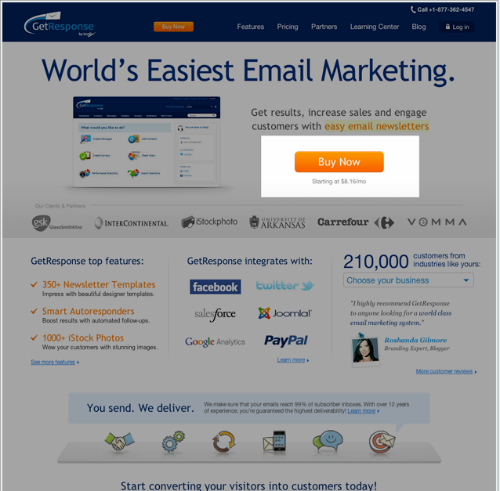
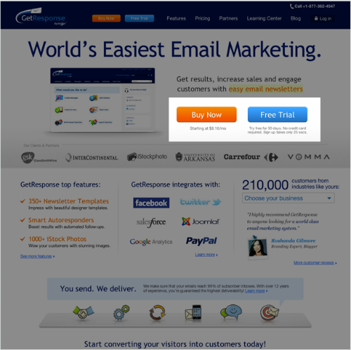
Visual Website Optimizer is one of my favorite split testing tools on the market. They’re a top notch company to boot. Below is a split test GetResponse.com ran using their tool.
Version A

Version B

What happened as a result of the test?
GetResponse noticed that by adding free trial buttons on homepage, the number of free accounts increased by 158.60%, while there was no negative influence on the number of paid accounts created via homepage.
source
Amazing what a difference a simple button can make. This test was about more than just a call to action though. They created a call to action that encouraged the visitor to interact with their product for free. The company gave up something of value in exchange for an opt-in.
Test #3 – Short Vs Long Copy Test
This is a test that Conversion Rate Experts ran for SEOMoz. This is a fairly complicated test because so many elements of the page were changed. So it’s not as simple as short vs long copy but that is a major element. In fact the long page was 6x’s longer than the original.
Here’s what the length of the pages looked like
Version A

Version B

What happened as a result of the test?
Using a statistically significant sample of more than 5,000 visitors, we achieved a 52% increase in sales of SEOmoz’s PRO membership.
source
Testing wildly different variations can sometimes lead to huge gains. This is particularly helpful when first starting out a new campaign and revitalizing old campaigns.
Hope you found these case studies enlightening. If you’ve got any questions please use the comments below!


